The term Styles may seem strange to most people. We think of the word Style in terms of designer clothing fashions. Changing styles is like changing clothing. You look different on the outside but are the same body on the inside. Styles are not only used for the way we control the appearance or design of print books, styles are also used to control the appearance or design of Ebooks and Websites. The key to easily migrate or convert styles from one information sharing format, such as a Print Book or PDF book, to another format, such as an Ebook or Web Page, is understanding the relationship between the tools used to set styles in these different formats.
|
Information Sharing Format |
Design Controlled by |
Content Controlled by |
|
Print Book or PDF Book |
Page, Paragraph and Character Styles |
Plain Text Language |
|
Ebook or Website |
CSS (Cascade Style Sheets) |
HTML (Hyper Text Markup Language) |
While Print and PDF books use the older Page, Paragraph and Character Styles, web pages and Ebooks use a new system called Cascade Style Sheets (or CSS). What we want is to use Page, Paragraph and Character styles that can easily be converted into CSS styles.
Content versus Appearance
Another way to think of Page, Paragraph and Character Styles is that they control the appearance of the content in your documents. Whether you are writing a one page resume or a 400 page book, your document can be divided into the content such as the words and images versus the appearance which is the appearance of the pages, paragraphs and text.
Why We Need to Consider Page Layout in Designing Documents
Here is the problem. Imagine you are teaching a course with 30 students. Ten of your wealthy students bought the Color Print Book for $60. Five others bought the Black and White Print book for $30. Five other students bought the Ebook for $20. Five of the poorer students downloaded the PDF version of your course book from your course website for free. Three printed the PDF book which at 10 cents a page for the 400 page book ironically cost them $40. Two other students did not have the money to print the PDF book – they are simply reading the PDF on their laptop computer screen. Finally, five of the poorest students are trying to get by reading the course book you posted as web pages on your book promotional website.
To make matters worse, all of your students are using a variety of computer screens, from laptops and tablets to mobile phones - all of which have different screen widths - to read their course book!

Now imagine you are trying to set up daily and weekly reading assignments for your students. You could just have the students read Section 3.1 for Monday and Section 3.2 for Tuesday. But imagine you want to review a particular topic in the Course book tomorrow morning and you want all 30 students looking at the same page.
The only way to solve this problem is if the content and appearance of each page in your course text book is identical regardless of the information sharing format being used by your students. Welcome to the world of the modern college classroom.
However, this new world of information sharing by means of multiple screen widths and document types is not merely limited to teachers and students. Imagine you are a small business owner and you want to share staff training materials with your employees. Some of your employees may download and print out a PDF of the training materials. However, others may try to read the materials directly from your company website. Then there are your customers wanting to buy products or learn how to use products they have already bought. They too will be using a variety of screen widths.
This is why it is important to learn about and consider the process of creating documents that are readable regardless of the screen width of the device being used to do the reading. Our goal is not merely to introduce you to custom Page Styles, but equally important to explain how to create a universal page style that will allow us to use the same source document for our print book, Ebook, PDF book and website.
What are Page Layout Styles?
Page layout styles determine and control the design or appearance of the entire page. This includes the width and height of the pages, page margins (top, bottom, right and left), paragraph widths (which is the width of the page minus the right and left margins) and the formatting of headers and footers at the top and bottom of each page (with associated page numbers). For complex documents, we will also need the ability to use more than one page style in the same document.
Paragraph styles control the appearance of various elements on a page including headings, spacing between paragraphs and line spacing inside of a paragraph. Character styles control the appearance of text inside of a paragraph including the font families, font size and font weight or emphasis.
The reason we cover page styles first is that when you create your own documents, you should get in the habit of first designing your page layouts. If you have more than one type of page layout, such as one style of page for the cover of your document and a different style for the contents of your document, then you will need more than one page style. After designing your page styles, you should consider the design of your paragraphs, characters (text), images and tables.
Comparing Page Layout Styles to Paragraph Styles and Character or Text Styles
Here is a table of some of the contents of all three style groups.
|
Page Layout Styles |
Paragraph Styles |
Character Styles |
|
Page Height |
Spacing between Paragraphs |
Font Families |
|
Page Width |
Line Spacing inside of paragraphs |
Font Sizes |
|
Page Top & Bottom Margins |
Default Paragraph style |
Font Weight or Emphasis |
|
Page Right & Left Margins |
Text Body Paragraph Style |
Font color |
|
Paragraph Width |
Heading 1 Style |
Link Text color and decoration |
|
Headers |
Heading 2 Style |
|
|
Footers |
Heading 3 Style |
How to Decide between using Page, Paragraph or Character Styles?
Rather than thinking of word processing functions as a series of random functions, always ask yourself: is the function I am working on affecting the appearance of my pages, my paragraphs or my characters?
The Effect of Page Layout Styles and Line Length on Readability
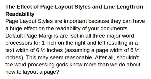
Page Layout Styles are important because they can have a huge effect on the readability of your documents. Default Page Margins are set in all three major word processors for 1 inch on the right and left resulting in a text width of 6 ½ inches (assuming a page width of 8 ½ inches). This may seem reasonable. After all, shouldn’t the word processing gods know more than we do about how to layout a page?
However, when speed reading a lot of text, you will find it much easier and quicker to read text that is set in 6 inch wide paragraphs (1.25 inch margins) as there are fewer words on each line and your eyes will have an easier time finding the beginning of the next line.
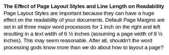
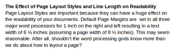
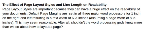
Here are screen shots of a section of text using various line lengths:
Five Inch Margins are not a very efficient way to read a lot of text. Studies have shown that changing lines too often can interfere with concentration and understanding of the text:
Six inch margins provide room for more content per line and result in fewer line changes while still being easy to scan from one line to the next:
Six and a half inch margins provide more room for content per line but can be harder to scan from one line to the next:
Many web pages fail to limit the width of the web page – forcing readers to read content that can be 8 inches wide or even wider!
One of the most important things you can do to improve the readability of your documents, books, reports and web pages is to increase your page right and left margins slightly from 1 inch to 1.25 inches in order to get a line length of 6 inches.
Line Length and the Ideal Character Per Line (CPL)
The readability of text is also related to font size and font families as smaller font sizes and narrower font families will result in more words – and more characters - on a given line – and thus be harder to read. Characters per line include the letters in each word and the spaces between words. Many studies have concluded that the ideal or most efficient number of characters per line is between 60 to 75.
Readability and Font Size
The standard font size in most word processors is 11 or 12 points. Historically, 12 points was also the most common font size for web pages. Back in the days of low resolution screens, this font size made sense. Because we are interested in font sizes that are readable on web pages as well as print books, and because screen sizes on most modern computers is 1920 by 1080 (which displays fonts smaller than on older screens with less resolution), we recommend increasing your font size to 14 points.
How to Convert Font Sizes from One Sizing Measure to Another
Word processors and web pages have several ways to specify font sizes. The most common way is by using Point units. However, your word processor may use pixels, ems or percents. Here is a table showing how to convert the most common font sizes to other units:
|
Points (pt) |
Pixels (px) |
Em (em) |
Percent (%) |
|
12pt |
16px |
1.0em |
100% |
|
14pt |
18px |
1.15em |
115% |
Readability and Font Families
Because fonts without decorations (called Sans fonts) are easier to read on computer screens, we recommend changing your font family to a sans font. The most common sans font for MS Word is called Arial. The metric equivalent of this font for a Linux computer is called Liberation Sans and the metric equivalent of this font for websites, also called a Google font, is Arimo. In this book, we recommend Arimo as a free universal and very legible sans font.
Font families not only come as Serif or San Serif, they also come with difference internal spacing – meaning that some fonts are narrow fonts while others are wider. Font family width also influences the number of characters per line. Once you know your font size, font family width and page content width (page width minus the right and left margins which is also called the column width on web pages), you can determine the number of characters per line.
We used to actually count the number of characters per line. Thankfully, there is now a website with a calculator to help us quickly determine this important number: https://grtcalculator.com/
Here is what the screen looks like with our recommended Font family, font size (in pixels) and content or column width (in pixels – note that 100 pixels is about one inch on a high resolution 1920 by 1080 screen):
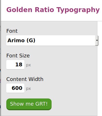
Click “Show Me GRT” and you will see that the Characters Per Line or CPL is 75 – which is widely considered to be the ideal CPL.
Here is a table showing the CPL for 12, 14 and 16 point font sizes and 600 versus 650 pixels (6 inches versus 6.5 inches).
|
Font Size (pt) |
Font Size (px) |
Screen Width |
CPL |
|
12pt |
16px |
600px |
85 |
|
12pt |
16px |
650px |
92 |
|
14pt |
18px |
600px |
75 |
|
14pt |
18px |
650px |
82 |
|
16pt |
20px |
600px |
68 |
|
16pt |
20px |
650px |
73 |
Sadly, the standard font size of 12 point and the standard page width of 6.5 inches results in a Characters Per Line of 92. If you used a standard 6.5 inch page width, you would need to use a 16 point font size in order to get your CPL down to 75 or less. These are just two of many reasons to increase your page right and left margins to 1.25 inches and thus create a content width of 6 inches.
Line Spacing and Readability
The readability of text is also related to Line Spacing (the vertical distance between lines in a paragraph) as more line spacing will make it easier to find the beginning of the next line – but will also result in fewer lines on each page. For example, “single” spacing of 1.0 puts lines too close to each other. We therefore recommend a line spacing of 1.15. Some studies have concluded that you can have up to 85 characters per line – but those studies tended to use Line Spacing of 1.5 or more. In short, putting more vertical space between lines may make it easier to find the next line and thus use a wider page layout. But the number of words per page will actually be less than a 6 inch wide page layout with 1.15 Line Spacing. Line Spacing is one of the Paragraph style functions we cover in the next chapter.
Page Layout, Line Length and Side by Side Editing
Another huge benefit of limiting your documents to a width of 6 inches (besides better readability) is that a narrower line length makes it much easier to do side by side editing or having two windows open at the same time on your computer desktop.
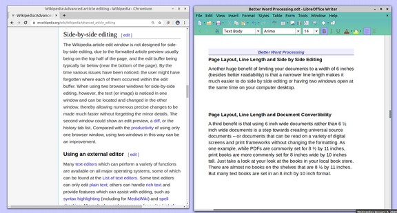
If you want to copy paste text or images from a web browser to a document, it is important to get into the habit of having two windows open at the same time on your desk top. Limiting the width of documents to 6 inches makes side by side editing much easier.
Page Layout, Line Length and Document Convertibility
Another huge benefit of limiting your documents to a width of 6 inches is that it makes it much easier to do side by side editing or having two windows open at the same time on your computer desktop.
A third benefit is that using 6 inch wide documents rather than 6 ½ inch wide documents is a step towards creating universal source documents – or documents that can be read on a variety of digital screens and print frameworks without changing the formatting. As one example, while PDFs are commonly set for 8 ½ by 11 inches, print books are more commonly set for 8 inches wide by 10 inches tall. Just take a look at your look at the books in your local book store. There are almost no books on the shelves that are 8 ½ by 11 inches. But many text books are set in an 8 inch by 10 inch format.