Image styles have the same benefit as Paragraph Styles and Page Styles. They give your documents, reports and books a more consistent and professional appearance. Image Styles make styling images faster and also give you more control over the way your images appear.
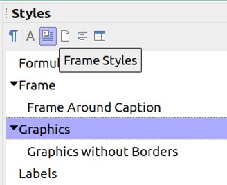
To modify the default image style in Libre Writer, or to create new image styles, click Styles, Manage Styles or click on the Styles icon in the left side of the Formatting Toolbar:

Images are called Graphics and all graphics in Libre Writer are placed inside of frames. So image styles are really a type of frame style. In addition to frame styles, this is also the place where you can modify or create Paragraph Styles (the first icon on the upper left), Character Styles (the second icon), Page Styles (the fourth icon), List Styles (the fifth icon) or Table styles (the sixth icon).
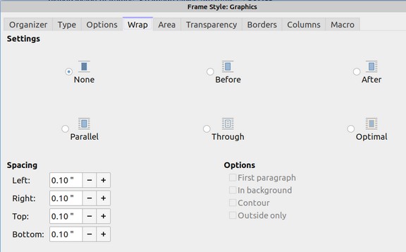
The default Graphic Style is set for Optimal Wrap (which means that the text flows around the image) with no Spacing between the Image and the surrounding text. These default settings are not ideal.
For clarity purposes, you are generally better off with No Wrapping because it is easier for your readers to tell when they should be reading text and when they should be looking at the image between the text.
No Wrap does require more room as it puts the image on a separate line. But if clarity is the goal, then it is worth using more room.
In addition, it is important to have at least one tenth of an inch of vertical and horizontal spacing between your images and your text.
To change these settings on all of the images in your document, you can either change these settings one at a time on each image, or you can change all of them by changing the default image style.
Right click on the word Graphic. Then click Modify to bring up the Image Properties screen.

Click on the Wrap Tab and change the Wrap settings from Optimal to None. Then increase the spacing to 0.10 inches for Right, Left, Top and Bottom. Then click OK.
There are times when you want to use Optimal Wrap. For example, you may have a very small image or simply want to save the room so as not to take up an extra page in your document. You can right click on that image and change its formatting. However, if this occurs often enough, you can create a new custom image style based on the default style but with wrap set for Optimal.
To create a new style from an existing style, simply right click on the default style and click New. Then give it a descriptive name like Graphic – Optimal Wrap and change the wrap setting. Then click Save. If you would like a border around some of your images, you could also create a style for this called Graphic with Border. You may also want to add new Graphic styles called Graphic in a Table and Graphic in a Feature Box if you want to style images in these differently than normal images that are not in a table or a Feature Box.
Why we need to put Text between Images
LO Writer gives you the ability to anchor images to either the Paragraph above it (which is the default anchor point) or to change the anchor point to Character. Changing the anchor point of an image to Character is recommended in some books and articles. Here we explain why this is bad advice.
Because images should be anchored to the paragraph below them, it is not wise to have two frames or images in a row. The two anchors can get confused leading to unpredictable results. When a frame or image starts jumping around, one can change the anchor from Paragraph to “As Character.” This will cause the frame or image to behave as if it were a typed in letter like the letter “A.” However, even if you change the frame or image anchors to “As Character”, frames and images can still jump around unpredictably – unless there is text between the two frames or images.
Adding text between images gives a more predictable result because it clearly tells not only Writer but also Print Books, Ebooks and Websites how to sequence the images. If for some reason, you need to put images in your document without adding text between them, the best way to insure that the images will stay in place is to put them in a table. If you do not want readers to know they are in a table, then hide the table borders.
Alternately, you can take a screen shot of the images or frames and then turn the combination into a single image - but the resolution of the combined image will not be as good as the two original images.
What you should not do is anchor images to or as characters. Anything anchors to or as a character is likely to be converted into a GIF image when converting a Writer document to an HTML or Epub document. GIF images in turn as likely to have massive file names severely harming the code for the Ebook or website. We realize that is many articles advocate stabilizing the position of images by anchoring them to or as characters. We think this is not good advice. Instead, always anchor images to paragraphs and then make sure that you have a clear paragraph of text to anchor your image to.

